Friday, 16 December 2011
Thursday, 15 December 2011


Evaluation Question 3 What have you learnt from your audience feedback?
Throughout my project I received different aspects of audience feedback these are 'go animate' videos which I have created in interview form which are split up into different sections
GoAnimate.com: Evaluation Question 3, part 1 by annacassidy-
Like it? Create your own at GoAnimate.com
GoAnimate.com: Evaluation Question 3, part 2 by annacassidy-
Like it? Create your own at GoAnimate.com
GoAnimate.com: Evaluation Question 3, Part 3 by annacassidy-
Like it? Create your own at GoAnimate.com
Secondary Research

From looking at my research you can see that the film Paranormal activity being viewed by 79% of 15-24 year old males. There is not much difference between the females and males as 47% is female and 53% is male. Similar to Paranormal Activity I would like for my products to have a balance in audience, resulting in a male and female audience, opposed to the majority of mainstream films; therefore allowing for my products to have a unique edge.
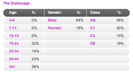
The orphanage is alike the genre of my film. Being a horror there appears to be much more of a difference between the percentage of 15-24 year old in comparison to Paranormal Activity. From The Orphanage results I can see that this film seems to have attracted males more that females, this is not what I want my film to be like as I would like it to attract a similar percentage between male and female audiences. To succeed with the results that I want, I intend to stick to my story line which is more like Paranormal Activity that The Orphanage. I feel that the male audience is particularly large for this film because the main protagonists of the film are mainly female, a factor which usually can grab a males attention, more than a females.
Although Paranormal Activity is a film it has the appearance of a documentary, which results in a more shocking and believable effect on the audience. My products feature an equal balance between the characters and the gender in my research resulting in both being Male and Female with none of them having any kind of sexual influences or sex appeal towards the film. This is due to the fact that the genre is horror and by deliberately not including any form of sexual connotations within them, I have maintained a level of seriousness and removed any light features.
My film tends to have a lower/middle class audience. My characters would have to have the right costume and attitude that my audience can relate to easily and feel at ease with. My trailer will have a soundtrack that will set a state of suspense and fear that will fit directly with my horror genre.
Audience Primary Research
Questionnaire
Age Group: 15-25 [ ] 25-34 [ ] 35-44 [ ] 45+
Gender: Male [ ] Female [ ]
1. What do you look for in a conventional horror film?
2. What persuades you to watch a film?
3. Hannah White is a young woman who has a troubled past who once had an identical twin called Jessica White. Both of them dealt with upfront abuse as a child as their father drank a lot of alcohol and abused them greatly. A year ago their father went crazy and tied Jessica and Hannah to a chair and set the house on fire that they lived in with Hannah escaping not being able to rescue Jessica resulting in her tragic death, she believes that ever since Jessica has been haunting her and blaming Hannah for her death. There is an endless struggle for Hannah to break free from Jessica’s anger and this film focuses on the strength of that.
What do you think of the plot of my film?
4. Which of these film magazines would you much likely buy?


Why? What makes you want to buy them the most?
5. How much would you pay for a film magazine?
6. Which one of the films posters do you like best?


Why?
What do you think of the colours, costume, props, location, etc?
What is the first thing that you notice about the film posters?
Monday, 31 October 2011
Character Research
For a long time now characters have been represented in horror films as 'evil'. In my trailer i would like to show my main character in my film to be portrayed in this way. They generally start off in the films as 'sweet and innocent' and then become 'evil'.
These are some examples of how these characters in horror films have been conventionally made up to fit the horror genre.


Here are three other examples of characters from horror films, the first image being the character from the film the Amytiville Horror, which follows much similar themes to which i want my trailer to be like, you can clearly see that this is girl is meant to be dead as she has a gun shot wound in her head which makes her character persona more disturbing.
The second image is the character that is used in the film the omen he is made to be very pale , and this image he is looking over his shoulder in the image and the background of the image is not in focus unlike him. Showing he is the main focus of the film.
The last image is alike the boy from the omen as the character is very pale and you can see bags under his eyes that suggest that there is something wrong/haunting about the character.


These are some examples of how these characters in horror films have been conventionally made up to fit the horror genre.
This is the character 'Samara' from the film 'The Ring' as you can see in the top image of her from the film she is conveyed as innocent and harmless, we can see this by the white that she is wearing and the pale skin and brushed long hair. However in the other image that we see of Samara we can see her to be very evil and a haunting character as she looks very scary !
The second image is the character that is used in the film the omen he is made to be very pale , and this image he is looking over his shoulder in the image and the background of the image is not in focus unlike him. Showing he is the main focus of the film.
The last image is alike the boy from the omen as the character is very pale and you can see bags under his eyes that suggest that there is something wrong/haunting about the character.

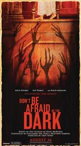
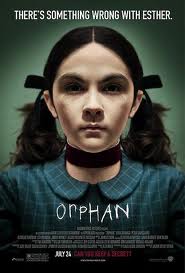
Above are three movie posters shown the first is a poster for the film 'Insidious' which is a recent release, the second poster being for a film called 'orphan' which is again quite a recent release, and the last film poster that is shown is from 'the exorcist'.
In all of the posters we see characters being perceived as dangerous beings and also we can see that they do not look like normal people in all of the posters there appears to be something wrong with all of them. I can clearly see that the characters are centrally framed and in a lot of cases this is what the poster looks like so the main focus is on that character. Alongside this factor the posters also have a colour scheme of very dark colours that fit in very well with the horror genre.
Tuesday, 4 October 2011
Plot/ Narrative
The plot of my story is about a young woman called Hannah White. Who has had a tormenting past regarding her family issues and her twin sister Jessica White.
The story commences with a bit of history about Hannah and her family, showing flashbacks to Hannah's past with her and Jessica being pleasant and happy children, we see them quickly grow up to be young women.
Throughout their lives we are told that their father Henry White, abuses the two girls drastically leaving them to be frail and scared.
Hannah ends up being a victim of a terrible past as her Father who suffers from mental issues and schizophrenia ends up tying the two girls two girls to a chair in their home with Hannah escaping and not being able to save her sister due to the extent of the fire.
The story commences a year later with Hannah trying to relive her life and not dwelling on her sisters death, but her sister seems to have an issue with this trying to ruin Jessica's life by haunting her in numerous occasions and when Hannah moves into her new home to start a fresh. Jessica does not allow this with numerous paranormal activities occurring in her home and unexplained situations. Until Hannah realises that it is her sister after trying a Priest to perform an exorcism in her own home and finding out it is her own twin sister.
This sends Hannah to despair we see her from wearing bright clothing and making an effort with her appearance to becoming very stressed wearing dull colours and not bothering with her hair or make-up.
The story ends tragically with her twin killing Hannah, and a squeal of the film to hopefully be released with the story of Hannah and Jessica White's tragic childhood.


Flat Plans
Movie Magazine Flat Plan

This is a rough outline of what i would like my film magazine to look like. I am calling my magazine 'FILM +' i took ideas for my film magazine from a few other film magazines which were, Empire Magazine, Total Film and Entertainment Weekly. I have used the simplicity and boldness of the Mastheads. The world 'Film' for my magazine i mainly took from Total film because i believe that it is just simple and straight to the point, which my target audience would like.
The name of my magazine 'Film+' i feel is very good for my audience as it suggests that the magazine contains a lot more information on the films hence the '+'.


From researching other film magazines to help me with the production of my product i am aware of different types of colours that would work well with my magazine front cover and also especially on my Mast head. I have noticed that most of the mastheads used on these magazines are bold and high level of clarity about them, the colours are simple but yet very eye catching. The letters are in bold and large. A lot the the time the letters in the mast head are in uppercase letters which i think would be a great idea for my magazine, just to help my audience be more interested in my magazine.
When i come to designing my front cover i may change the colours i have planned to have my masthead to be black, so it therefor stands out more to my audience and fits the horror genre of my film very well. The colours i will be using over all will be black, grey and red, enabling me sticking to the three colour palette rule, which will portray my magazine to look more professional and sleek alongside my magazine looking more organised. I plan to use the colour grey for the background of my magazine, as i wish to indicate a grey scale approach, and make my magazine have a more sinister approach. The colour white in my magazine will allow some features which may have a higher level of importance too stand out a lot easier in comparison to others.


The magazines that i have researched all seem to show the protagonist on the front cover where as in my magazine i wish to show the antagonist the photos shown in the magazines appear to be mid shots and i feel that these have been used purposely for the audience to be able to relate to the audience, also by the usage of the midshot i am able to see the props clearly also.
Movie Poster Flat Plan

For my movie poster my main image is going to be a door with my antagonist of my film stood in a door way. This image signifies my film because the antagonist is haunting a house, and it shows to the audience that something disturbing is happening.
Although there is no colour in my rough cut design i know the colours that i intend to use in my poster when i design it on PhotoShop, i wish to use the three colour rule as i am using in my magazine front cover which are red, grey and black, these colours allow me to stay related with my genre. I need to still take the photo for the background of my photo, it will be a long shot so that my antagonist can be fully seen, making her appear to be more creepy/scary. My antagonist will be in the same costume which she has been shown in in my Magazine and my trailer, which will be a ripped dress.
 This poster is from the film Insidious, this film has been one of the main focus points of my film campaign. In this poster they portray the antagonist centrally a like my own poster. The poster also seems to show the same colours in which i want to include in my poster which are red, grey and black. The poster has a dull colour scheme as the back ground is black which i wish for my poster to be like. The dark colours give the idea of the black being overpowering or maybe even make the poster seem like it relates to darkness or a eviler side than what we experience in our everyday life.
Subscribe to:
Comments (Atom)